Does This Color Make My Office Building Look Fat?
- Alice Devine
- Oct 5, 2018
- 2 min read
Updated: Sep 21, 2021
Color theory—the study behind the shades and tones—informs our perceptions of the environment.
Boston’s Prudential Center shouts at me, across busy Boylston Street. How? With its bright orange building color, encased and capped in glass, that commands attention. Of course, knowing that color communicates is no revelation. Heck, honeybees have made their living off it for millions of years. Understanding the human emotional and cultural responses to color, however, and how those might translate to real estate leasing and marketing, requires some deeper thought. After all, yesterday’s avocado green is today’s living wall in emerald green—related, but oh, so different.
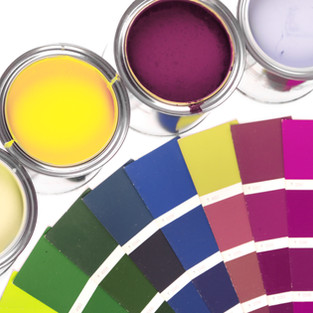
Color theory—the study of visual effect of specific color combinations—allows design choices that evoke a desired market response. For example, the color red can speed the pulse, increase the respiration rate, and raise blood pressure. Red is associated with words like 'winner, achiever, intense, impulsive or active,' but also 'danger.' Think Las Vegas neon, prodding gamblers. Conservative blue suggests confidence, harmony, responsibility, and reliability. Think clear skies, calming travelers. According to color theorists at Pantone, “The psychological association of a color is often more meaningful than the visual experience.”
“The psychological association of a color is often more meaningful than the visual experience.”
In addition, cultures have their own color associations which influence perceptions and decisions. For example, the red that might indicate luck and prosperity in China signifies mourning in South Africa. South Africa’s national flag even utilizes red to reflect sacrifices made in the fight toward independence. So, cultural sensitivity matters.
Whether choosing hues for a marketing flier or an architectural feature, designers rely on specificity and impact. In fact, Pantone credits itself with “inventing a universal color language” (the Pantone Matching System) that assigns a numerical value to each shade. Its precise color identification ensures consistency throughout the printing phases so that regal purple does not print as bubblegum pink. An industry influencer, Pantone even designates an annual color of the year. This year’s hot hue? Ultra Violet. While few office buildings may adopt this color, such trends do impact design choices which will elicit reactions from tenants.
Landlords also use color to leverage leasing efforts. Consider one historical high-rise in downtown San Francisco. While not LEED-certified for sustainability, the building has a robust recycling program, secured and nicely appointed bicycle storage room, and—best of all—operable windows. Operable windows! So, in order to communicate these environmentally-friendly attributes, the property management company uses bright green (with its nature connotation) on its marketing materials.
Like Boston's Prudential Center orange that signals "Hey! Check us out," landlords and property managers may benefit from thoughtful color choice. Front row New York Fashion Week tickets not included.
#vscocam #boston #architecture #orangeisthenewblack #colortheory #commercialrealestate #Boston #PrudentialCenter #realestate
Sources:
https://www.pantone.com/color-psychology-how-does-color-affect-us
https://www.huffpost.com/entry/what-colors-mean-in-other_b_9078674


Comments